Londoncentric world map
Some people think that the world map centred on Greenwich is an unnecessary layover from the times of empire. Of Course, many countries issue maps with themselves more central.
The majority of world maps use what is called the Mercator projection. This is a projection based on putting the sphere of the world inside a cylinder. The position of a location on the globe projected onto this cylinder is then where it occurs on the map. This has the nuance of distorting the polls and making areas closer to the poles much larger than they actually are.
There have been many attempts to change the projection using other techniques that push the distortions to different places. There are maps that attempt to keep the relative surface area of countries accurate to life.
The nature of creating a flat representation of the surface of a sphere is that you will always have distortion. It isn’t possible to represent a curved geometry on a flat plane without distortion.
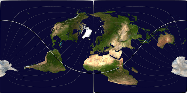
Since we can choose our distortion and since I want to be at the centre of the map I chose to use the standard Mercator projection but instead of the equator being in the middle, London would be.
The code to manage this manipulation is simple but I spent quite a while struggling with the coordinate transformation because I started counting with the top left as zero rather than Null island being 0 and off to the left being negative.
The result is something of beauty. You can see that the normally distorted poles are now represented far more accurately. Africa is not made as small as usual. North America and Russia seem much closer, they are no longer opposite sides of the map.
The distance of New Zealand from London is represented well, the distance to Australia seems vast.
One aspect of this representation of the world is that the shortest path from London to anywhere on earth is a straight line across this map. That helps to show why on a regular map transatlantic crossings always seem to arc.
I love this representation of the world so much that I’ve printed posters of it and put them up on my wall. It’s also for sale if you want to get yourself a copy.


nice
ReplyDelete